Adding and Managing Fields
Posts and taxonomy terms in Directories Pro are composed of pre-defined set of fields. These are called default fields, which are defined automatically and only once during plugin activation.
On the other hand, custom fields are fields that can be defined manually in addition to the default fields. These fields are used to store and display additional pieces of information for each content item, and can be freely defined or deleted. You can add custom fields to any content type (Listing / Review / Claim / Category / Location / Tag) in Directories Pro.
Editing a default field
We will explain here in detail how you can edit a default field, by actually editing one of the default fields defined for listings.
Login to your website if not yet logged in and go to the WordPress administration dashboard.
Click Directories in the admin sidebar.
Under the All Directories tab, click the gear icon in the row of the directory that you wish to configure.
Under the Content Types tab, click the dropdown button in the Listing row and then click Manage Fields.
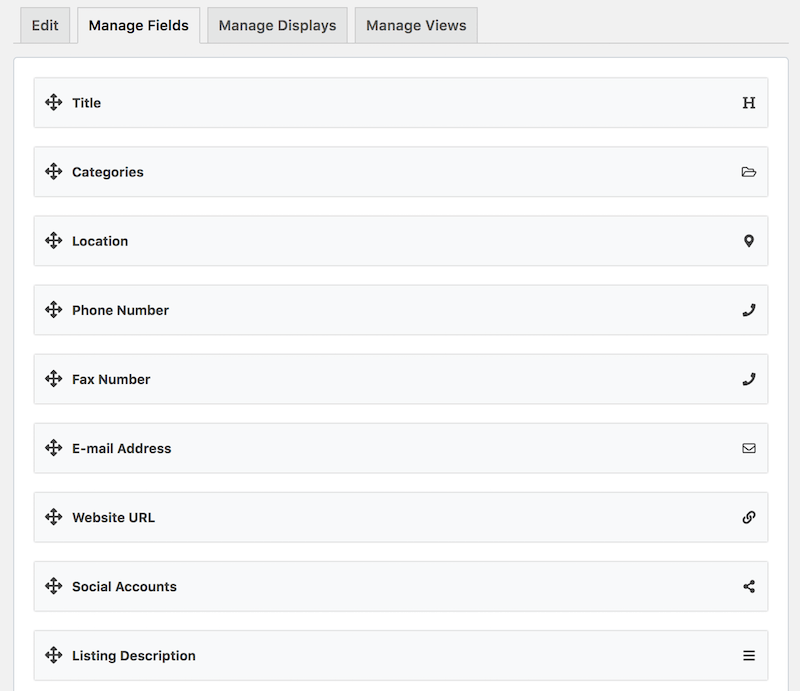
This page shows a drag and drop editor that lets you manage fields for listings. It lets you design the listing submission form used both in the backend and the frontend. Each grey box in the editor is referred to as an element in this documentation.
Hover over to the Listing Description element and click the gear icon which will open a popup window containing a configuration form for the element.
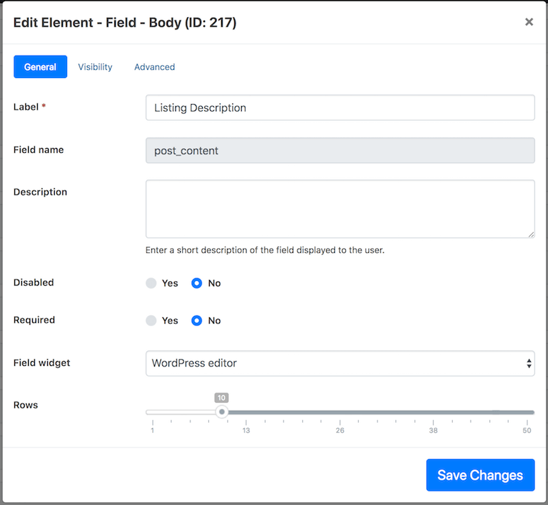
General Settings - Configure general settings of the element. The options displayed here depend on the type of the element currently being edited.
Some notable options are:
Label - Label for the field in the add listing form. This setting may not be empty.
Form field type - Choose how the field is displayed in the listing submission form.
Visibility Settings - Shows settings related with the visibility of the element, such as an option to restrict the element to be viewed by certain user roles.
Advanced Settings - Shows a setting for adding a CSS class to the element.
Select Textarea field for Form field type under the General Settings tab.

Press the Save Changes button.
Now that the form field type of the field has been changed from WordPress editor to Textarea field, click Add Listing under your directory menu in the admin sidebar.
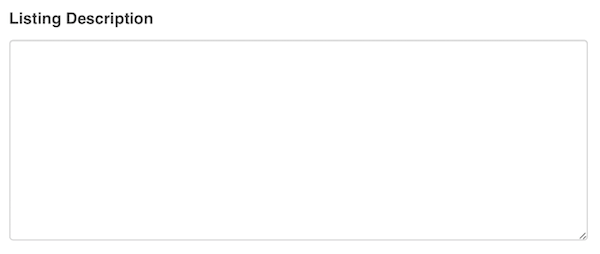
As you can see, the Listing Description field now displays a simple textarea field instead of the default WordPress rich text editor.
Adding a custom field
We will explain here how you can define a custom field, by actually adding a new custom field to listings.
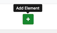
On the form editor page, click the green Add Element button with a plus sign at the bottom of the page:
A popup window will appear as below:
Click the Field tab, hover over to the Choice element and click.
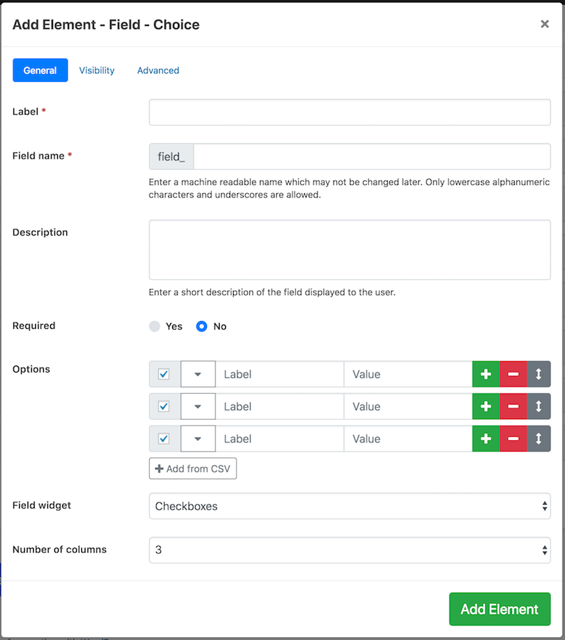
General Settings
Enter or select the following values for each setting:
Label - Features
Field name - features
Options - Click the Add from CSV button, then copy & paste the whole text below into the textarea.
Takes Reservations,reservation,fa-phone
Accepts Credit Cards,cc,fa-credit-card
Apple Pay,applep,fab fa-apple-pay
Delivery,delivery,fa-motorcycle
Outdoor Seating,outdoor,fa-tree
Good for Kids,kids,fa-child
Good for Groups,groups,fa-users
Waiter Service,waiter,fa-user
Take-out,takeout,fa-shopping-bag
Wheelchair Accessible,wheelchair,fa-wheelchair
Has TV,tv,fa-tv
Dogs Allowed,dogs,fa-paw
Sells Gift Certificates,gift,fa-gift
Alcohol,alcohol,fa-beer
Has Music,music,fa-music
Karaoke,karaoke,fa-microphone
Parking Lot,parking,fa-car
Valet Parking,valet,fa-taxi
Free Wifi,wifi,fa-wifi
Smoking Allowed,smoking,fa-fire
Shower,shower,fa-shower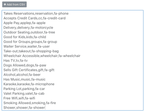
Form field type - Checkboxes
Display inline - No
Number of columns - 3
Max number of values - Unlimited
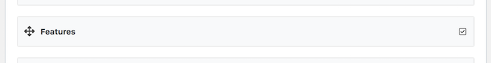
Press the Add Element button at the bottom of the popup window. A new field element labelled Features will be added to the editor as below.
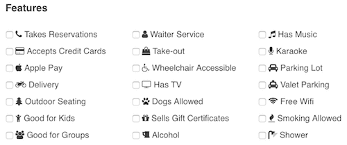
Now, visit the Add Listing page of your directory. You should see the newly added Features field in the add listing form as below.
Deleting a custom field
Follow the instructions below to delete a custom field.
On the form editor page, hover over to the custom field element which you wish to delete, and then click the red trash icon.
Click OK in the popup alert box.
The field element will disappear and is removed from the add listing form.
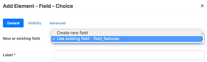
Re-using custom fields
Custom fields are re-useable. That is, you can add custom fields that you have created previously to another content type in the same directory or to content types of other directories. Note that you can not add a custom field again to a content type that already has the field assigned.
In order to re-use a custom field, simply select from one of the existing fields from the New or existing field dropdown shown in the field configuration form when adding a field.
Adding conditional rules
Note: This feature is available from version 1.1.0.
Conditional rules let you define dependencies between fields. That is, you can have certain fields shown/hidden depending on the values of other fields.
To add conditional rules, click the Conditions tab in the popup form when adding or editing a field.
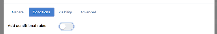
Then, toggle the Add conditional rules switch.
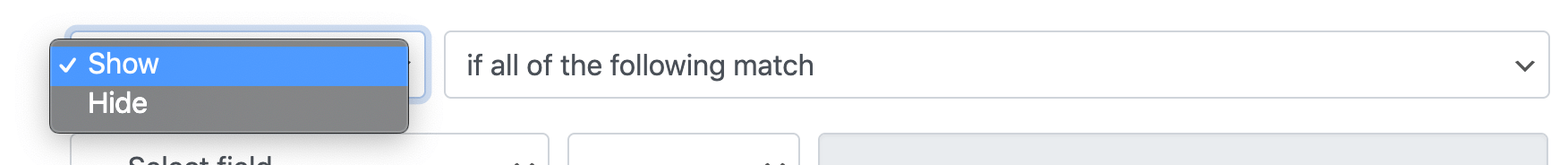
Select Show or Hide from the first dropdown and then if all of the following match or if any of the following matches from the next dropdown.
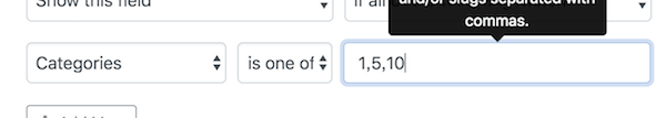
You can then add as many rules as you like by selecting fields that the current field depends on and entering values that need to be matched with those fields in order for the current field to be shown or hidden.
For example, select Categories, is one of, and enter 1,5,10 to the text field so that your field will be shown/hidden if one of the three categories (categories with ID 1, 5, or 10) is selected for the Categories field of the content item being edited.
Use the Add More button to add more rules. To delete a rule, hover over to the rule that you wish to remove and click the red button displayed.
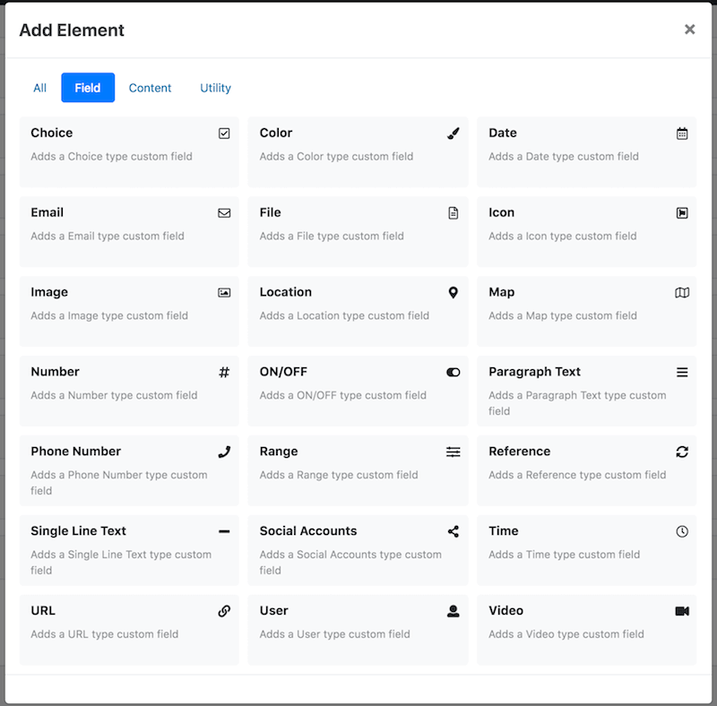
Available elements
There are by default 3 types of elements that can be added to build the form: Field, Content, and Utility element types.
Below are the default elements available for each element type.
Field
Field elements add fields to the form for accepting various type of inputs.
Choice - A multi-purpose field which lets you choose values from one or more options. It can be rendered as a select list, radio buttons, or checkboxes.
Date - Lets you enter date and time (optional) values via an intuitive user interface.
Email - Lets you enter e-mail addresses. Optionally lets you enable MX record checks to ensure the e-mail addresses exist.
File - Enables uploading various type of files to be attached to the content item. Uploads can be restricted by file extension and/or size.
Image - Enables uploading image files to be displayed with the content item. Uploads can be restricted by file size.
Location - Lets you select a location on a map and enter address details for the location.
Number - Lets you enter numeric values either through a text or slider field.
ON/OFF - Renders a checkbox field.
Paragraph Text - Lets you enter multi-line text values. It can be rendered as a plain textarea or WordPress rich text editor field.
Phone Number - Lets you enter phone numbers with an option to configure an input mask.
Range - Displays a slider input interface to select a specific range of numeric values.
Reference - Lets you select other content items, either of the same content type or a different one, with auto-suggestions. Content items can even be from other directories as well.
Single Line Text - Lets you enter single line text values with optional features such as input validation and masking.
Social Accounts - Presents fields to enter social media account info.
Time - Shows an intuitive user interface which lets you enter time or time range values and/or select days of week.
URL - Lets you enter URLs.
User - Lets you select user accounts registered on the site with auto-suggestions.
Video - Lets you add videos by specifying video URLs or IDs.
Content
Content elements are used to display or embed custom content into the form.
HTML - Lets you add a custom HTML text to the form.
JavaScript - Lets you embed a custom JavaScript code into the form.
Text - Lets you add custom non-HTML text to the form.
Utility
Utility elements include elements that can organize or group other elements, or elements that do not belong to other element types.
Columns - Groups multiple elements and display them in columns.
Group - Groups multiple elements to act like a single element.
Separator - Adds a horizontal line separator used to separate elements.
Tabs - Groups multiple elements and display them in tabs.
reCAPTCHA (requires Directories - Frontend plugin) - Displays a CAPTCHA field using Google reCAPTCHA API.