Managing and Customizing Displays
Displays define how individual posts and taxonomy terms are rendered in the frontend. The following is the list of displays available by default.
Detailed - This display is used to render the full detail of a content item when visiting its permalink URL.
Summary - This display renders summarized information of each content item, usually when a group of content items are displayed. For example, when listings are displayed on the directory main page in List or Masonry view mode.
Dashboard Row (requires Directories - Frontend plugin) - This display is used to render each content item as a table row in the frontend dashboard.
Note that not all content types have all the displays above available.
Editing a display
Displays can be edited using a drag and drop display editor in the backend. We will explain here in detail how you can customize a display by actually editing the Detailed display for listings. Here you will add the following 2 new sections to the display.
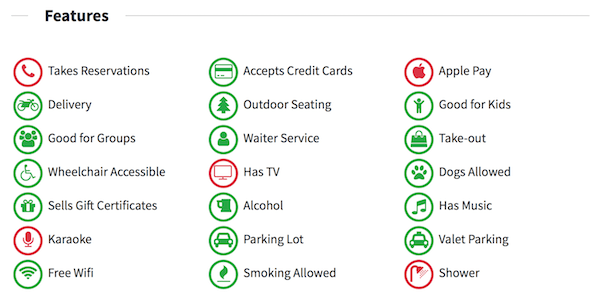
Features - lists all the services and amenities available with the currently displayed listing.
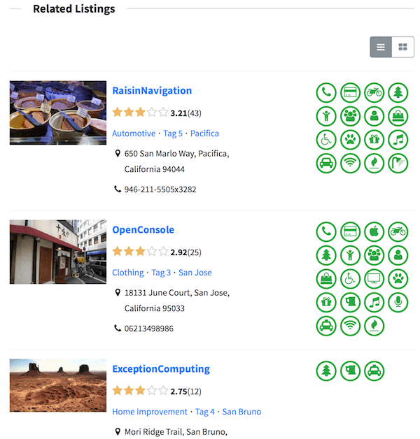
Related Listings - displays listings related with the currently displayed listing in row and grid layouts.
Editing the Detailed display for listings
Follow the steps below to start editing the Detailed display for listings.
Login to your website if not yet logged in and go to the WordPress administration dashboard.
Click Directories in the admin sidebar.
Under the All Directories tab, click the gear icon in the row of the directory to edit.
Under the Content Types tab, click the dropdown button in the Listing row and then click Manage Displays. The page should now look like below showing a drag & drop display editor.
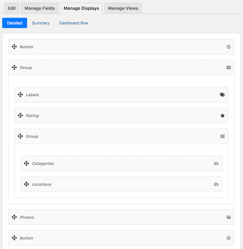
Each grey box in the editor is referred to as an element in this documentation.
You can drag the elements to wherever you wish for a certain content to appear, configure elements, or add new elements to the display.
Adding the Features section
Before proceeding to the next step, make sure first that you have created a custom field titled Features using the Choice type field by following the instructions in Adding and Managing Fields - Adding a custom field.
On the display editor, make sure the Detailed sub-tab is selected. Then, scroll down to the bottom of the page and then click the green Add Element button with a plus sign which opens a popup window.
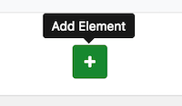
In the popup window, select the Field tab and click Features.
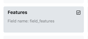
Under the General Settings tab, configure settings as follows.
Label - Default label
Show label as heading - Yes
Field Renderer - Checklist
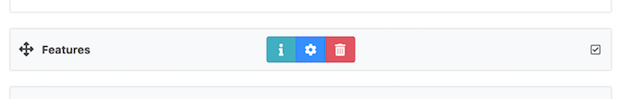
Leave other settings as-is and click the Add Element button at the bottom of the popup window. This will add a Features field element to the display as below.
Adding the Related Listings section
We will first add a new custom field to listings so that listing authors or administrators can select related listings when adding/editing a listing. Follow the steps below to add such field.
Click the Manage Fields tab.
Click the green Add Element button with a plus sign at the bottom of the page.
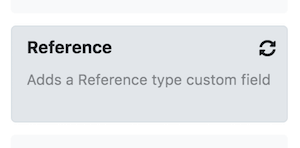
In the popup window, select the Field tab and click Reference.
Under the General Settings tab, configure as follows.
Label - Related Listings
Content Type - XXXX - Listing (where XXXX is the label of your directory)
Max number of values - Unlimited
Press the Add Element button at the bottom of the popup window. A new field labeled Related Listings will be added to the form editor.
Try adding or editing listings and see how the field works. The field in the listing form should look similar to below.
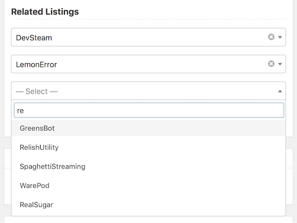
The field has an auto-suggest feature enabled so that you will see auto-suggested listings below the field while typing into the field. Add some related listings using the field so that they can be displayed with the Detailed display.
Now, let's go back to the display editor page of the Detailed display and add an element to the display that will render related listings.
On the Detailed display editor, click the green Add Element button with a plus sign at the bottom.
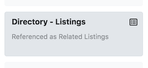
In the popup window, select the Content tab and click the element labeled XXXX - Listings (where XXXX is the label of your directory) which has a description shown as Referenced as Related Listings.
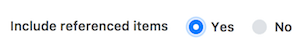
The element will display listings that are referencing the current listing as a related listing. For example, if listing A, B, and C were selected as related listings when adding or editing listing D, then the element will display listing D as a related listing when viewing listing A, B, or C. By default, the display element will not display anything for listing D.
However, you may also want to show listings A, B, and C as related listings when viewing listing D. In that case, select Yes for the Include referenced items option under the General Settings tab.
Leave other options as-is and click the Add Element button at the bottom of the popup window.
That's all for editing the display. Try adding or editing listings and see how the Detailed display is rendered on single listing pages in the frontend. The Features and Related Listings sections on the page should look similar to below.
Styling elements
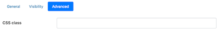
You can style an element by adding a CSS class to the element and then applying custom CSS rules to the class. When adding or editing an element, click the Advanced tab and enter a custom CSS class name to the CSS class setting. You can insert multiple CSS class names by separating them with a space.
To add custom CSS rules to the class, you can either add them to the style.css file of your current theme or via the custom CSS editor available for each display which can be found under the display editor.
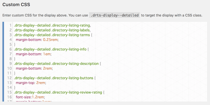
We recommend using the CSS editor since that allows you to export and import your custom CSS rules as well when you export and import directory settings.
Adding conditional rules
Note: This feature is available from version 1.3.0.
Conditional rules let you show/hide elements depending on one or more field values of the content item displayed.
To add conditional rules, click the Conditions tab in the popup form when adding or editing an element.
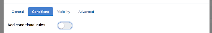
Then, toggle the Add conditional rules switch.
Select Show or Hide from the first dropdown and then if all of the following match or if any of the following matches from the next dropdown.
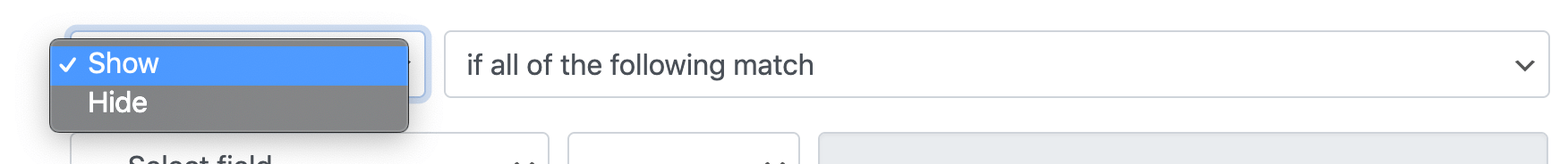
You can then add as many rules as you like by selecting fields and entering values that need to be matched with those fields in order for the element to be shown or hidden.
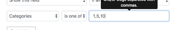
For example, select Categories, is one of, and enter 1,5,10 to the text field so that the element will be shown/hidden if one of the three categories (categories with ID 1, 5, or 10) is assigned to the content item currently displayed.
Use the Add More button to add more rules. To delete a rule, hover over to the rule that you wish to remove and click the red button displayed.
Available elements
There are by default 3 types of elements that can be added to displays; Field, Content, and Utility element types.
Below is the list of elements available by default. Note that some elements may be available for certain content types only. You should also see more elements available if you add custom fields.
Field
Field elements render field values of the content item to display.
Author - Renders a thumbnail image and/or the username of the content author.
Opening Hours (Listing) - Renders a table of opening hours.
Categories (Listing) - Renders a list of categories associated with the listing.
Date Established (Listing) - Renders the established date entered for the listing.
Description (Category / Tag / Location) - Renders the description of the taxonomy term.
E-mail Address (Listing) - Renders the e-mail address entered for the listing.
Fax Number (Listing) - Renders the fax number entered for the listing.
Field Template - Displays custom content rendered by a template file and have it act as a field. See Template Files for more details.
Listing Description (Listing) - Renders the description entered for the listing.
Location (Listing) - Renders the location address of the listing in a customizable format.
Locations (Listing) - Renders a list of location taxonomy terms associated with the listing.
Payment Plan (Listing) - Renders the name and/or expiration date of the payment plan associated with the listing.
Phone Number (Listing) - Renders the phone number entered for the listing.
Photos (Listing) - Renders photos uploaded for the listing.
Price Range (Listing) - Renders the price range specified for the listing.
Publish Date (Listing / Claim / Review) - Renders the date/time of the content published.
Rating (Review) - Renders overall rating score or rating bars.
Review (Review) - Renders the review body.
Social Accounts (Listing) - Renders links to social media pages associated with the listing, embeds Facebook Page plugin or Twitter Feed.
Tags (Listing) - Renders a list of tags associated with the listing.
Title - Renders the title of the current content item with an option to link the title to the permalink URL of the content item or to a URL of another field.
Website URL (Listing) - Renders a link to the URL entered for a listing.
Message (Claim) - Renders the message text entered for the claim.
Thumbnail (Category) - Renders the thumbnail image of the category.
Photo (Location) - Renders the photo image of the location.
Content
Content elements let you add various types of content to the display.
Button - Renders call to action buttons.
Child Terms (Category / Tag / Location) - Renders child terms of the taxonomy term
Comments (Listing / Review) - Renders comments submitted for the listing.
Contact Form (Listing) - Renders a contact form for sending messages to the listing author.
HTML - Renders a custom HTML text, with support for WordPress shortcodes.
JavaScript - Renders a custom Javascript code.
Labels (Listing / Claim / Review) - Renders small tags adding context to the listing.
Rating Stars (Listing) - Displays rating of the listing with interactive star icons.
Review Ratings (Listing) - Renders overall review score or rating bars in a customizable format.
Statistics (Listing / Review) - Displays various statistics of the content item with icons and numbers.
Template - Displays custom content rendered by a template file. See Template Files for more details.
Text - Renders a custom non-HTML text.
Utility
Utility elements let you organize or group elements.
Columns - Groups and displays multiple elements in columns.
Field List - Groups multiple Field type elements and renders them as a definition list.
Group - Groups multiple elements to act like a single element.
Separator - Adds a horizontal line to separate elements.
Tabs - Displays multiple elements in tabs.